 |
The hand lettered opening title for the 1935 movie “Thanks a Million” is rendered in a condensed, thick and thin Art Deco sans serif design.
It is now available as the digital typeface Stocks and Bonds JNL – in both regular and oblique versions.
 |
The hand lettered opening title for the 1935 movie “Thanks a Million” is rendered in a condensed, thick and thin Art Deco sans serif design.
It is now available as the digital typeface Stocks and Bonds JNL – in both regular and oblique versions.
 |
The free form hand lettering from the titles and credits of the 1964 French film comedy “Le Gendarme de Saint-Tropez” [“The Policeman from Saint-Tropez”] was the basis for Off Duty JNL – which is available in both regular and oblique versions.
 |
The hand lettered title found on the 1924 sheet music for the tango “Sentimiento Gaucho” (“Sentimental Gaucho”) offered a different take on the thick-and-thin lettering that permeated the late 1920s through the Art Deco age.
A ‘slash’ or ‘swipe’ is cut through the characters (similar to “Directa JNL” – another take on this type of design).
Last Tango JNL is the digital recreation of this novelty lettering and is available in both regular and oblique versions.
 |
The hand lettered opening title for the 1935 movie “Thanks a Million” is rendered in a condensed, thick and thin Art Deco sans serif design.
It is now available as the digital typeface Stocks and Bonds JNL – in both regular and oblique versions.
 |
“One Hundred Alphabets for the Show Card Writer” was published in 1919 to afford sign artists the ability to create signs and show cards in then-contemporary lettering styles.
One such alphabet was big, bold and representative of the Art Nouveau stylings popular in the early part of the 20th Century. Most likely it was applied to store sales and public events that were casual and informal, for its letter forms are free of any constraints.
This design is now available as Fun Time Nouveau JNL in both regular and oblique versions.
 |
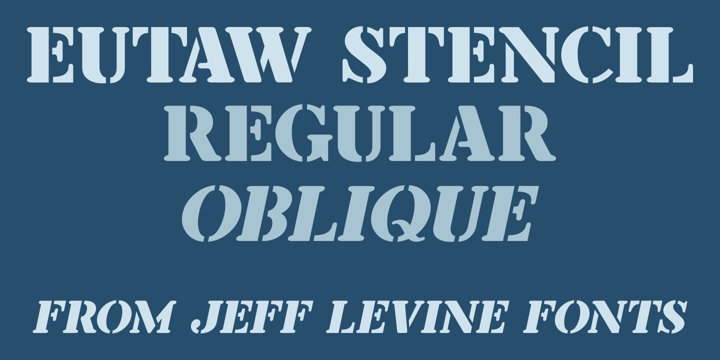
A hand lettered emulation of a Roman stencil type face on the cover of the folio for the Stenso School Set was the basis for Eutaw Stencil JNL, which is available in both regular and oblique versions.
The Stenso School Set (circa 1940-41) was comprised of three stencils – two lettering guides and a map of the [then] 48 United States.
Developed and patented by Baltimore school teacher Ruth Libauer Hormats, her stencils were the first to offer a system for accurate letter spacing and ease of use.
“Eutaw” (as part of the font’s name) is taken from Eutaw Place, the street where Ruth and her husband lived at the time of Stenso’s inception. To the Cherokee, the name means “Creek Indian”.
 |
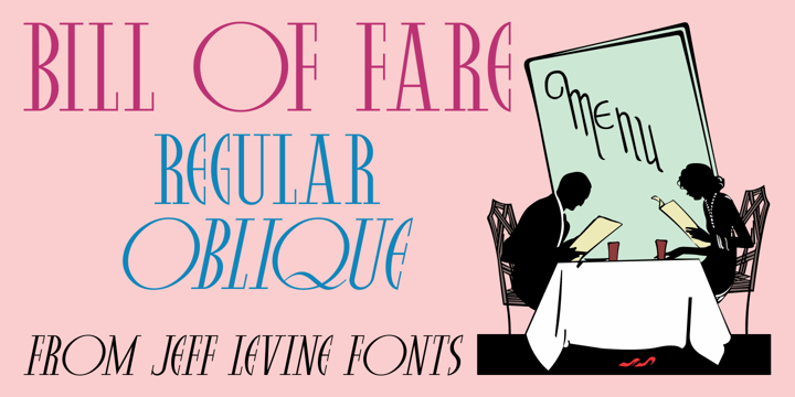
A 1942 menu cover for the restaurant at the Biltmore Hotel in Los Angeles features its name in a stylized Art Deco serif design.
This is has been turned into the digital typeface Bill of Fare JNL, and is available in both regular and oblique versions.
©
Dean Aksakova
2014 . Powered by
Blogger
Blogger Templates
.
.