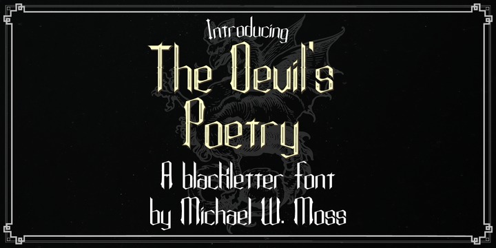
The Devil's Poetry is a new blackletter typeface from Michael W. Moss.
The lowercase letters feature a pleasing hexagonal visual cadence while the capital letters stand tall and modestly ornate.
The Devil's Poetry is available in three styles and features a Unicode Latin Extended-A character set.
"Sarcasm is The Devil's Poetry."
Download The Devil's Poetry Fonts Family From Michael W. Moss
Download Balig Script Fonts Family From Panatype Studio
January 12, 2020
Hand Lettering
,
hand-drawn
,
handlettering
,
handwriting
,
handwriting font
,
Handwritten
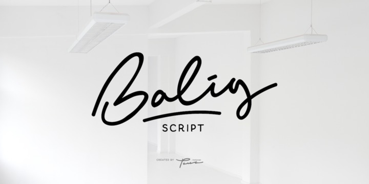
Balig Script is signature pen script, available in 2 fonts with 2 styles ( Normal & Bold ), and includes Swashes. It's perfect for signatures, logo type, weddings, posters, brochure or any display use.
Balig Script comes with more OpenType features like Stylistic Alternates, Initial Forms, Terminal Forms, and also Standard Ligatures make this font more natural and letter nicely.
Download Cattedrale Fonts Family From Creativemedialab
January 12, 2020
blackletter
,
blackletter fonts
,
blackletters
,
ornament font
,
ornamental
,
ornamental font
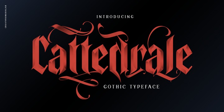
Introducing Cattedrale, a gothic style Blackletter font with a strong and elegant look includes a full set of capital and lowercase letters, multi-lingual support, currency figures, numerals and punctuation.
Arrange the nice and unique ornaments with Cattedrale Ornament, or add into your display letters to make it look more sweet and stunning.
Cattedrale is perfect for tattoos, clothing, labels, packaging, branding, headings, or any Gothic themed projects!
Download Hicksons Fonts Family From Gleb Guralnyk
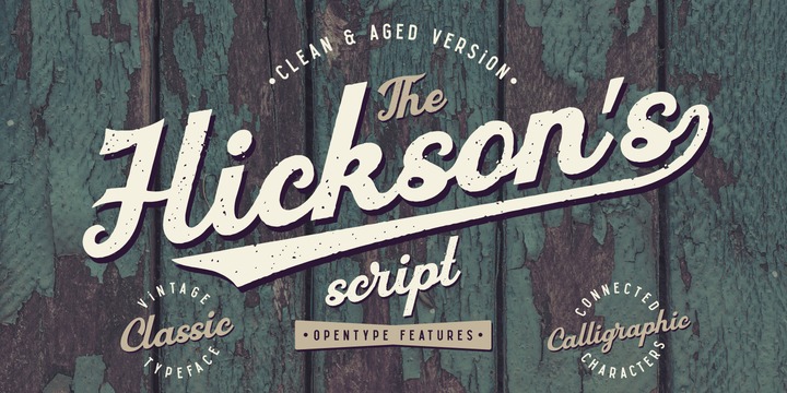
Hicksons is a new calligraphic vintage script. It has a classic authentic look in two variations with clean and aged textured characters. This font has lots of OpenType features, like ligatures, swashes and stylistic alternates.
Thank you and have a nice day!
Download Bountiful Signature Fonts Family From Arendxstudio
January 12, 2020
beautiful font
,
best seller
,
blog tittle
,
blogger font
,
branding font
,
calligraphy
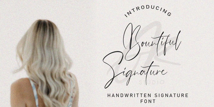
Bountiful Signature is a high energy signature-style script font guaranteed to make a big impression. Digitally hand-drawn, it's super-clean smooth flow and high-intensity pen strokes make an unmistakeable impact in logo/branding projects, large header text and product packaging.
Features:
1.Uppercase & Lowercase
2.Numer & Punctuation
3.Multilingual support
4.Ligatures
5.Alternates
There it is! I really hope you enjoy it - comments & likes are always welcome and accepted. More importantly, don't hesitate to send a message if you have a problem or question.
Now just read this, go there and make it happen :)
Download Typist Slab Fonts Family From VanderKeur
The typeface Typist originated during an extensive research on the origin and development of typewriter typestyles. The first commercially manufactured typewriter came on the market in 1878 by Remington. The typestyles on these machines were only possible in capitals, the combination of capitals and lowercase came available around the end of the nineteenth century. Apart from a few exceptions, most typestyles had a fixed letter width and a more or less unambiguous design that resembled a thread-like structure. A lot of this mechanical structure was due to the method the typestyles were produced.
Looking at type-specimens for print before the first typewriters were good enough to came on the market we can see that in 1853 and in 1882 Bruce’s Type Foundry already had printing type that had a structure of the typewriter typestyles. Of course printing types were proportional designed as typewriter typestyles had a fixed width. So it is possible that except from the method of production for typewriter typestyles, the design of printing types were copied.
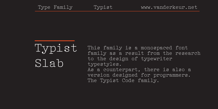
In the design of the Typist, the purpose was – next to the monospace feature – to include some of the features of the early typewriter typestyles. Features such as the ball terminals and the remarkable design of the letter Q.
This new typeface lacks the mechanical and cold look of the early typewriter typestyles. The Typist comes in six weights with matching italics in two versions. One that resembled the early typewriter typestyles (Typist Slab) and a version designed with coding programmers in mind (Typist Code).
Download Typist Code Fonts Family From VanderKeur
The typeface Typist originated during an extensive research on the origin and development of typewriter typestyles. The first commercially manufactured typewriter came on the market in 1878 by Remington. The typestyles on these machines were only possible in capitals, the combination of capitals and lowercase came available around the end of the nineteenth century. Apart from a few exceptions, most typestyles had a fixed letter width and a more or less unambiguous design that resembled a thread-like structure. A lot of this mechanical structure was due to the method the typestyles were produced.
Looking at type-specimens for print before the first typewriters were good enough to came on the market we can see that in 1853 and in 1882 Bruce’s Type Foundry already had printing type that had a structure of the typewriter typestyles. Of course printing types were proportional designed as typewriter typestyles had a fixed width. So it is possible that except from the method of production for typewriter typestyles, the design of printing types were copied.
In the design of the Typist, the purpose was – next to the monospace feature – to include some of the features of the early typewriter typestyles. Features such as the ball terminals and the remarkable design of the letter Q.
This new typeface laks the mechanical and cold look of the early typewriter typestyles. The Typist comes in six weights with matching italics in two versions. One that resembled the early typewriter typestyles (Typist Slab) and a version designed with coding programmers in mind (Typist Code).
Subscribe to:
Posts
(
Atom
)